I would like you to please take some cues on UI from Upstox in future, because if User Interface is visually appealing that could drive some users into Dhan platform
And also if possible kindly try to provide
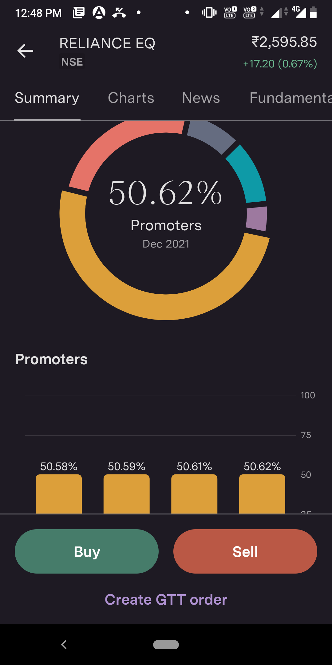
I have attached screenshot of Upstox UI
I would like you to please take some cues on UI from Upstox in future, because if User Interface is visually appealing that could drive some users into Dhan platform
And also if possible kindly try to provide
I have attached screenshot of Upstox UI
@PravinJ , Mee too.
Fonts are not so good… If dhan prefers to have this kind of fonts for signature model or setting a base to others. I request to use tillana font instead for text and regula calibri or verdana font numbers .
Too many bold fonts
Blank spaces in majority of recycler layouts
Need many optimizations to utilize the phone screen layout.
Thanks for sharing this idea! it’s one we have heard before, So we’ll make sure it’s on our list to be considered when we are ready to make some changes. You’re right, we could do this better.
Thanks for being open & honest about your experience.
I have recently joined Dhan and really the UI is boring and slow. Even on a screen refresh rate of 90hz, the scrolling is really slow. Check the link for the screen recording.