I have some suggestions regarding UI of web.dhan.co. I am no expert in UI development but this is what I feel should be changed to optimize the screen space. I hope you guys consider my suggestions.
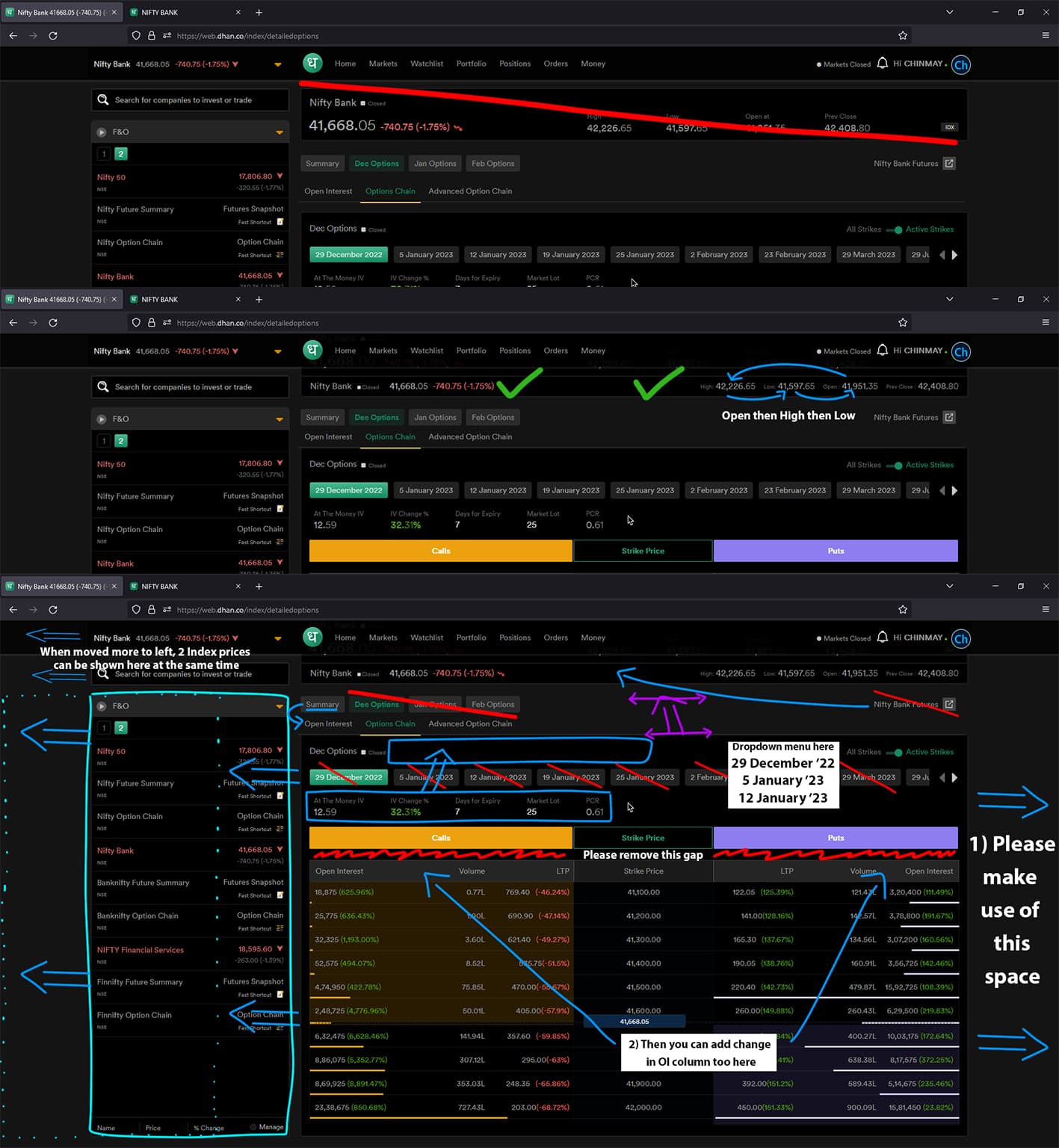
Regarding screenshot 1&2:
In screenshot 1, that top banner is taking too much space and is also scroll able which is not needed. The second screenshot below is better and should be kept that way. Just one small suggestion, mention Open first then High & Low.
Regarding screenshot 3:
1] (Dec options) (Jan Options)… and (29 Dec 22) (5 Jan 23)… buttons are opening the same thing, no need for double buttons for same menu.
2] On both sides there are empty spaces please make use of it
3] Other UI improvement suggestions are shown clearly below.
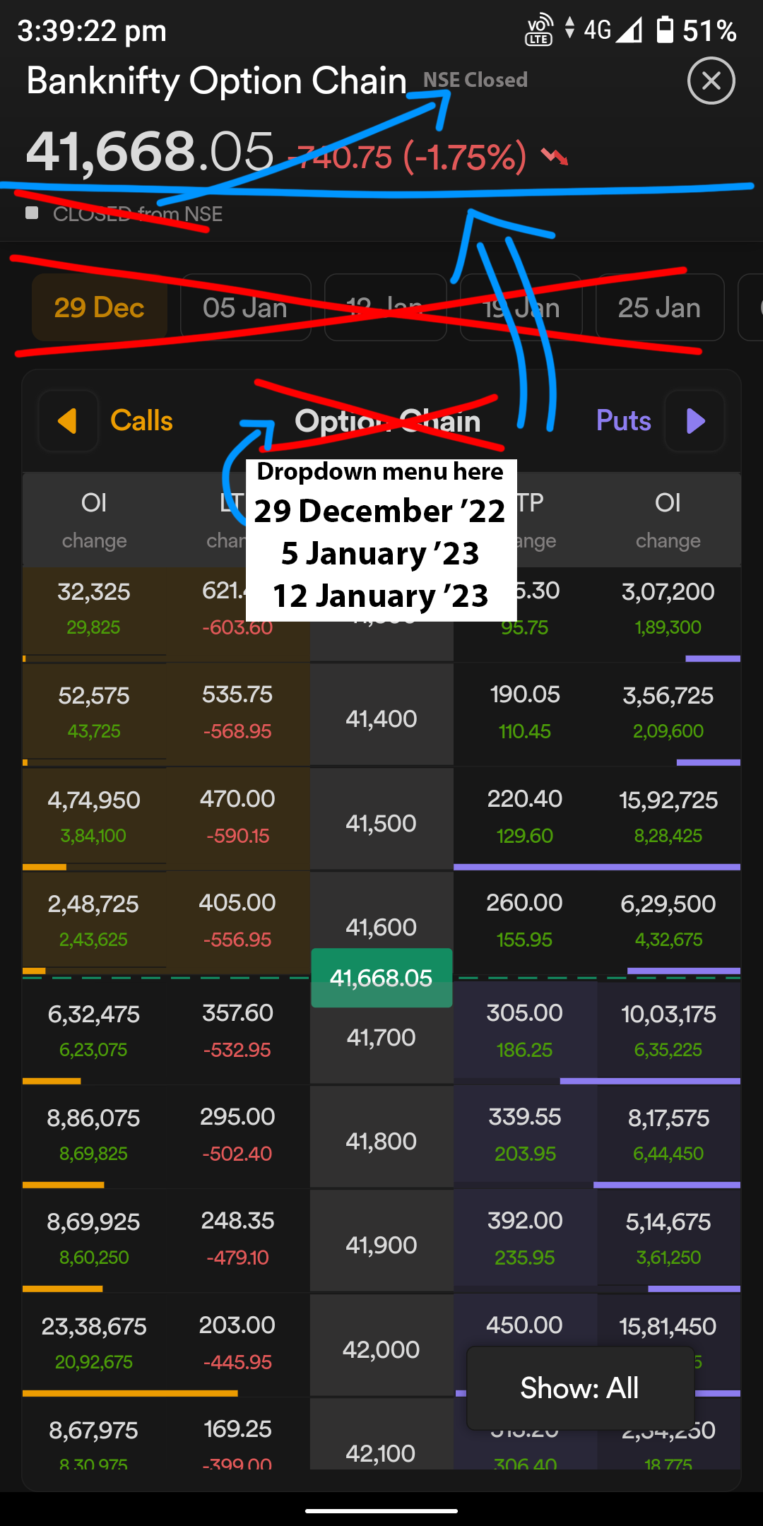
Same for mobile app, screen space is wasted unnecessarily and also “Option Chain” word is written 2 times!! Why?? Please consider this to optimize as it will show more option contracts in same space.
Thanks @Chinmay for the notes and appreciate your efforts in putting this together. Will share these with our design, product teams and evaluate the changes.
Thank you @PravinJ sir considering my suggestions.
Also, one more thing, regarding the options trader web, I had registered for it and the rollout for access has also started but I haven’t received the access yet.
For now we have given access to only a few users from the registration list, taking feedback from them and improving the experience.
We will plan to open Options Trader for all by end of January, and pending invitations will be sent to users by second or third week. You should get access in the next batch.