Dear Dhan,
why don’t you work on improving the UI? It seems like the UI looks old… (ex: color appearance) overall the platform was good.
After minor color changes
Dear Dhan,
why don’t you work on improving the UI? It seems like the UI looks old… (ex: color appearance) overall the platform was good.
After minor color changes
Hi @Siddharth
Feedback noted. Dark mode on Dhan has to get a UI updated, we have done this for usual mode for web but are bit lagging behind for dark mode. We will pick this up soon.
Hi @PravinJ
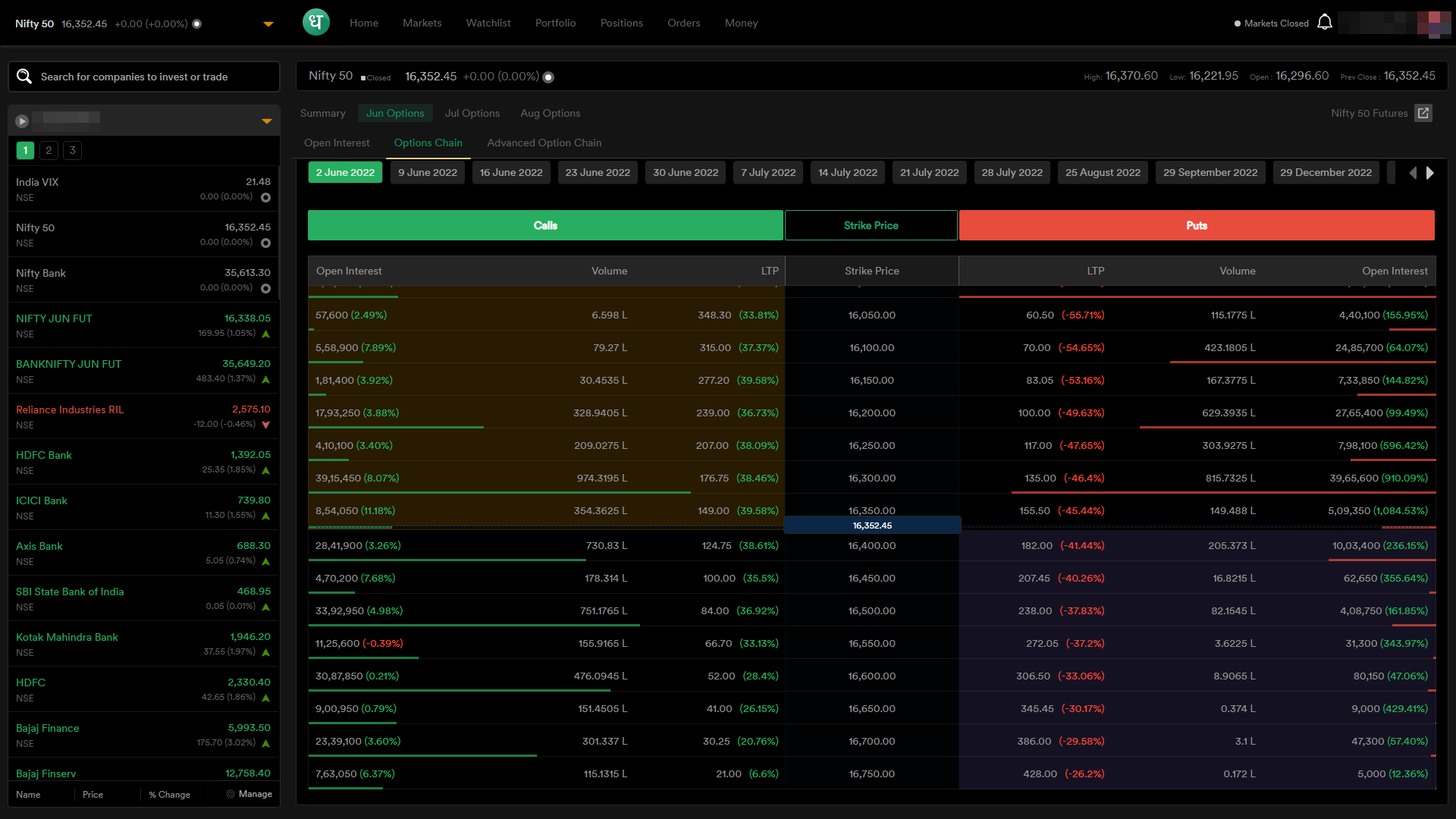
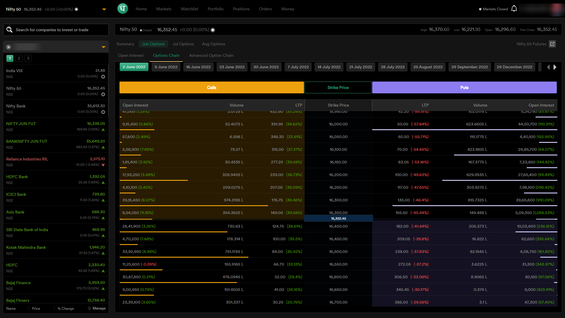
I have slightly changed the colors of the dark mode for myself and using a custom CSS extension in my browser. Especially there’s was a dark black background for columns which looks foreground text bad.
I have made the following changes for dark mode:
Thanks you Sid 
You are helping us do things better
In the era of minimalist design, I feel the UI of Dhan web is partially cluttered and Dhan Mobile app is heavily cluttered. We can’t even zoom in without losing the data.
At least, change the font.
Rest I’m very much excited to be part of the new broker giving so much functionality.
How about you make your mobile app like Binance lite toggle?