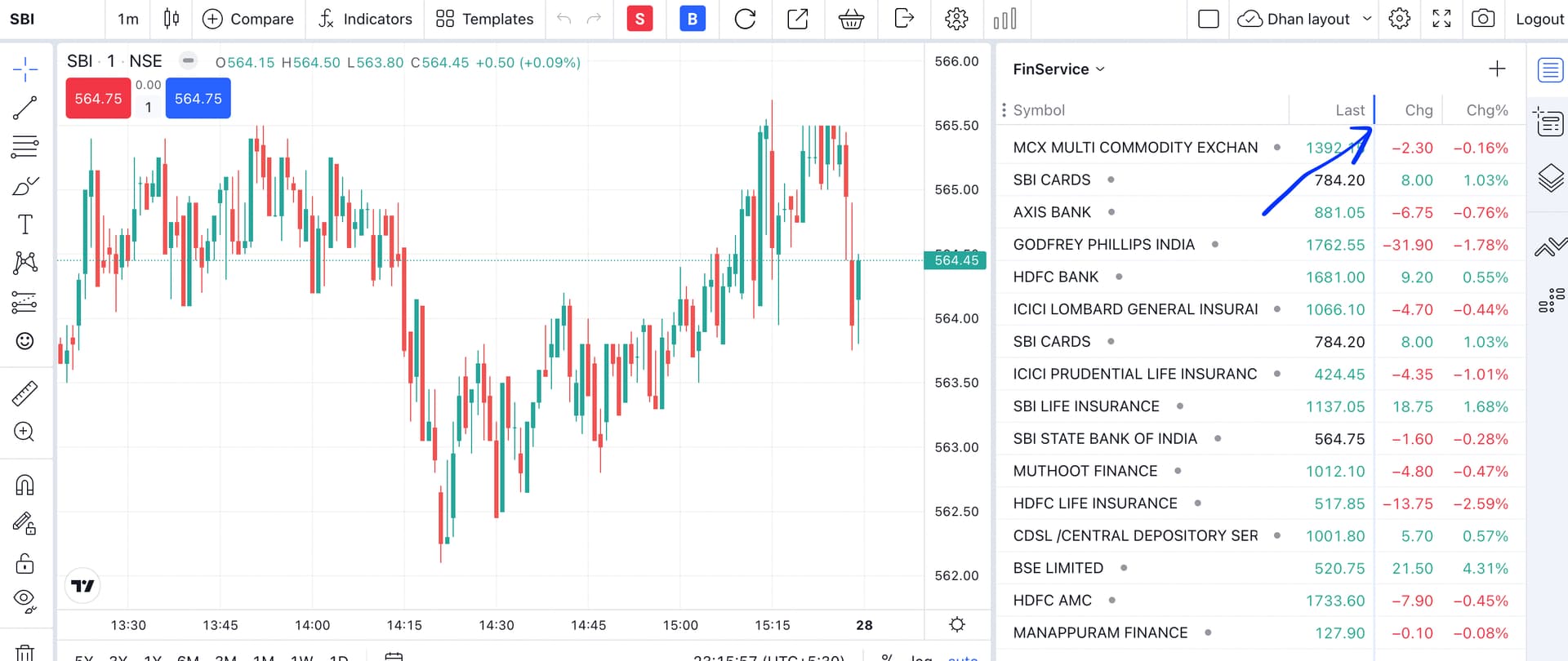
watch list not comfortable since it is not user friendly. What I meant is that in dhan watchlist for example if we want to check some option prices it’s extremely difficult.
because for example bank nifty 43100 call ltp chg chg%.
all these columns are extremely far away from each one which makes very difficult to see strike prices unless we drew chart to extreme left .
In trading view & fyers watch list is simply good. I want to see same watch list layout in our dhan too.I don’t think i explained the problem the way you people understood. but I tried to say the problem of the watch list in our dhan view.
so I think we can rectify watch list like this:
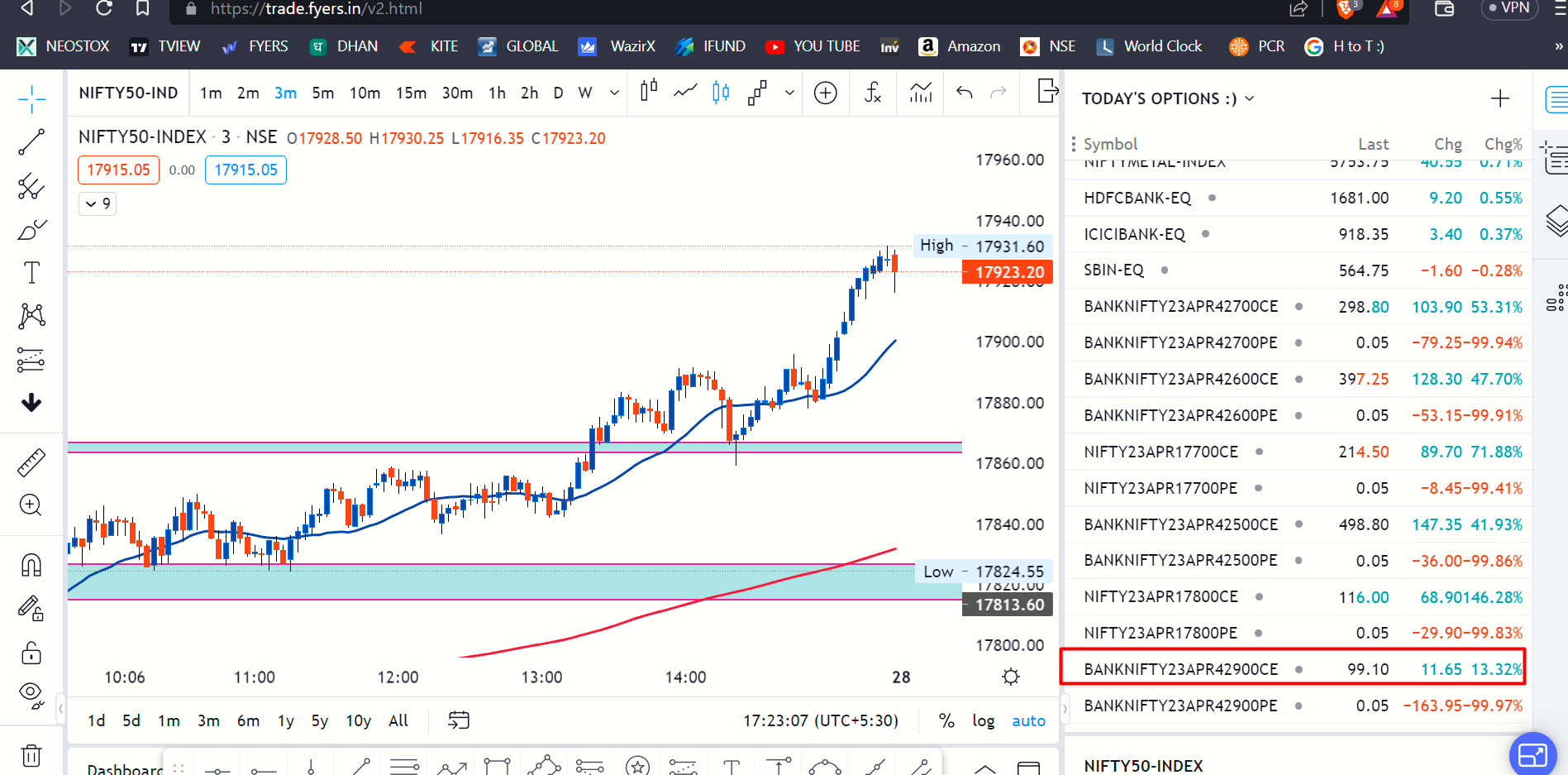
so please check our watch list as well as fyers watch list you will come to know which watch list is comfortable to watch & user fiendly.
Hope my suggestion is welcomed by you and make sure to rectify .
grow together
Thank you
Ram Aditya
client id :1100577631