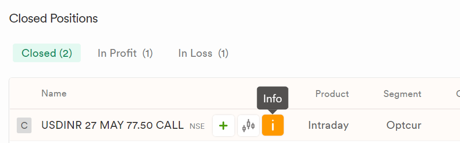
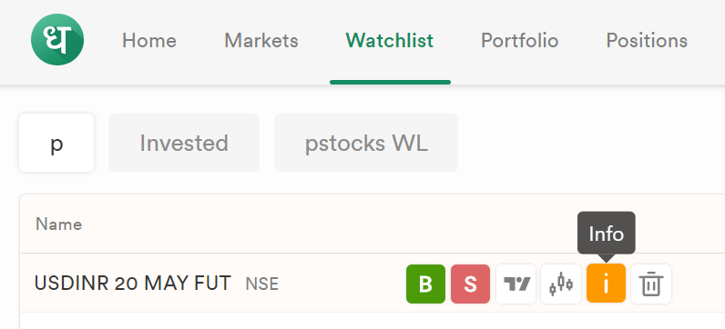
In the watchlist, when clicking on a yellow background row or the ‘i’ button, both triggers the same action. So, may be ‘i’ button can be removed to keep the UI tidy enough.
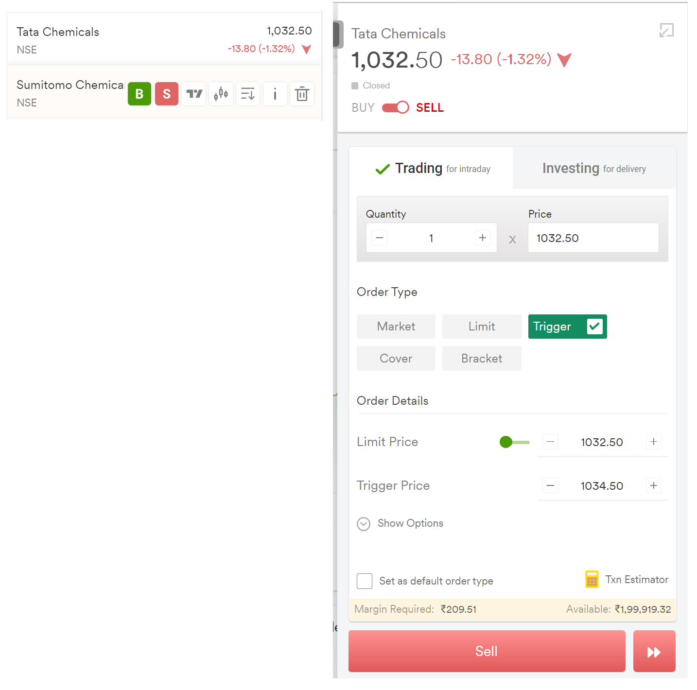
While placing a sell order, the green color buttons of Order Type and Order Details confuses my mind (and may be also of many others like me).
In the watchlist, when clicking on a yellow background row or the ‘i’ button, both triggers the same action. So, may be ‘i’ button can be removed to keep the UI tidy enough.
I see that the above suggestion got implemented but needless to say that it should be done consistently in all the relevant places.
Few examples: Closed Positions, Portfolio, Watchlist etc.
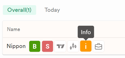
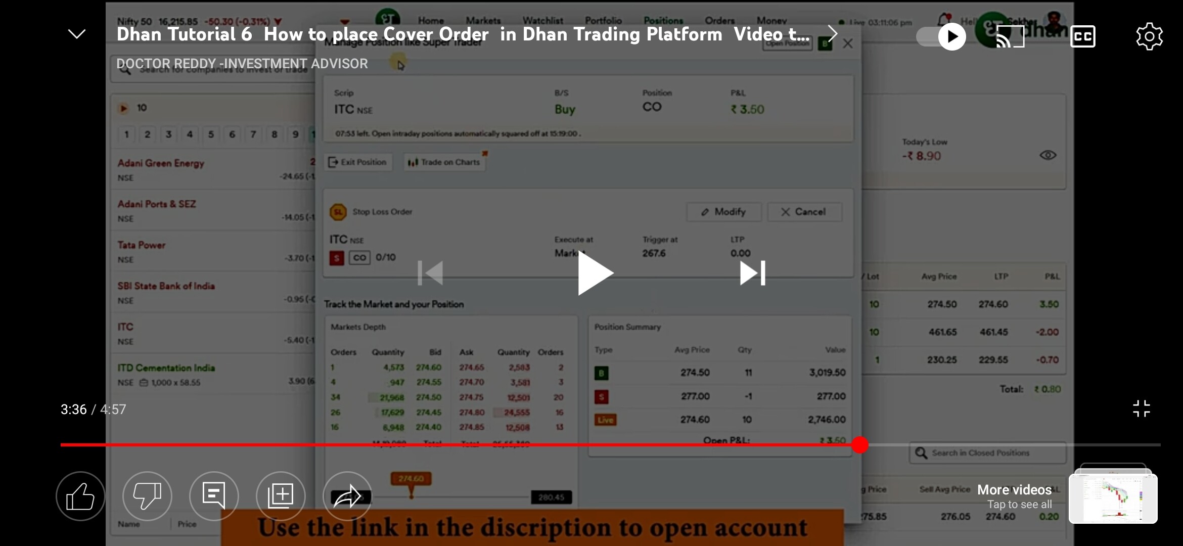
Hi @amit@pushpa In the positions “I” button has a diffrent purposes …it will not give info about that stock …it will open a popup of your current position…super trader popup …